Remember my trip to Colorado this summer? While I drove around the countryside, blabbing with my mom during forays into town for groceries, inspiration struck like a lightening bolt. Seriously. WHAM. Mailboxes! MAILBOXES! I had an aesthetic fit right then and there. All conversation stopped as my face took on some weird expression…I don’t know…maybe Mom thought it was tummy turmoil, but for me? Awestruck. A painting with mailboxes. Wait…MANY paintings with mailboxes! After I explained that my tummy felt great, Mom began to realize the creative juices were flooding and she could not deny my inspiration. Nay, in fact, she began to think they ALL deserved a photo! She and I drove around while I took pics of mailboxes. And let me tell you, they are glorious in their own right. So much personality packed into each grouping or singular box! This could be a series. Visions of glory danced in my head. I’ll…I’ll win prizes with these mailbox paintings! Yeah, that’s it! I’ll become famous! Maybe George Clooney wants a painting of mailboxes (who wouldn’t?). The president will invite me to the White House for a dinner while we discuss my mailbox fetish!
But in reality, here I was, just Mom and I, taking scads of photos of mailboxes on a lone country road, with tractors and ranch hands moving on past. I’m sure they were wondering what in the world this crazy lady was doing with her camera on the side of the road. Nonetheless, I had a dream I was pursuing!
Then, home again, with the photos in hand and the task set before me to paint the first of the most amazing paintings EVER of mailboxes. So! I began:
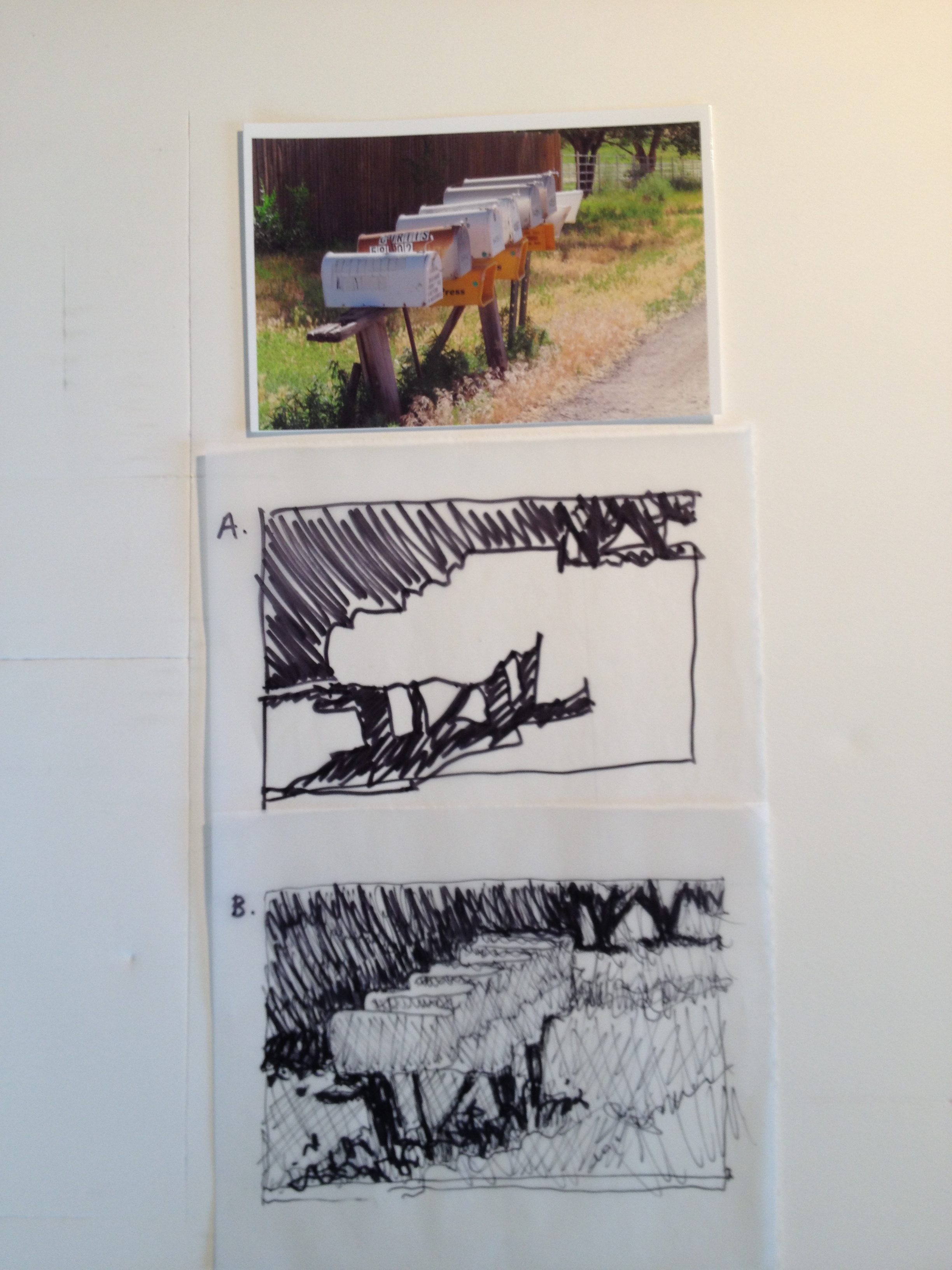
As I began to plan this painting, I did a quick value study to group and establish large shapes of the same lightness or darkness in interesting interactions around the canvas (plexiglass). I placed the first mailbox in the front lower 1/3 of the canvas, as my focal point. In that area will be the most detail, most value contrast and greatest interest. All other shapes such as the posts, trees and vegetation are supporting cast members. Their duty lies in reinforcing attention on the focal point.
Completed drawing on gessoed plexiglass below:

I placed liquid mask in areas that I wanted to remain white, so I could paint freely without worrying about losing crisp white edges.
I wanted this painting to be heavy on texture, since the mailboxes, the wood supporting structures, and the vegetation were all very textural. To do this, I added salt to the surface before I began to paint. This remained on the surface and dried with a grainy-look.

I also added squares of regular paper and tracing paper into the gesso. Tracing paper wrinkles magnificently when it gets wet, and gives the surface a look like this:

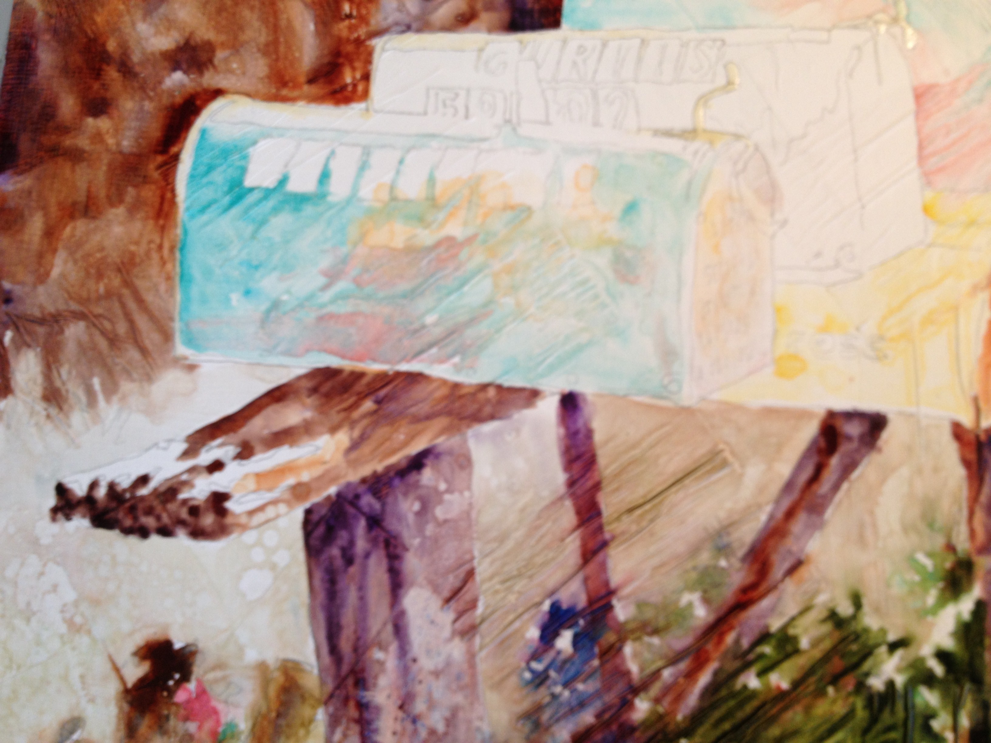
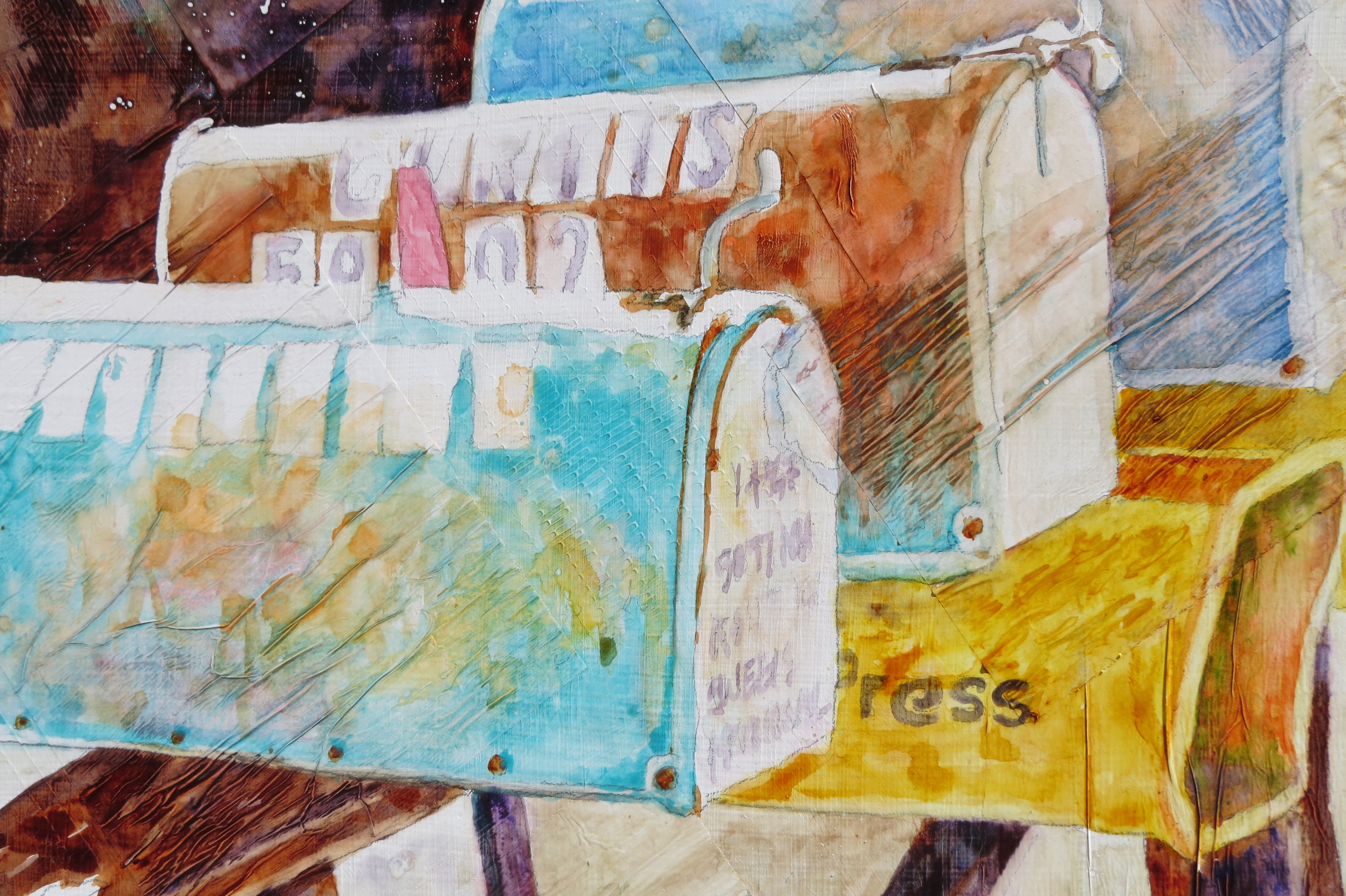
Crazy, right? Here’s a detail look of the focal point after the first wash:
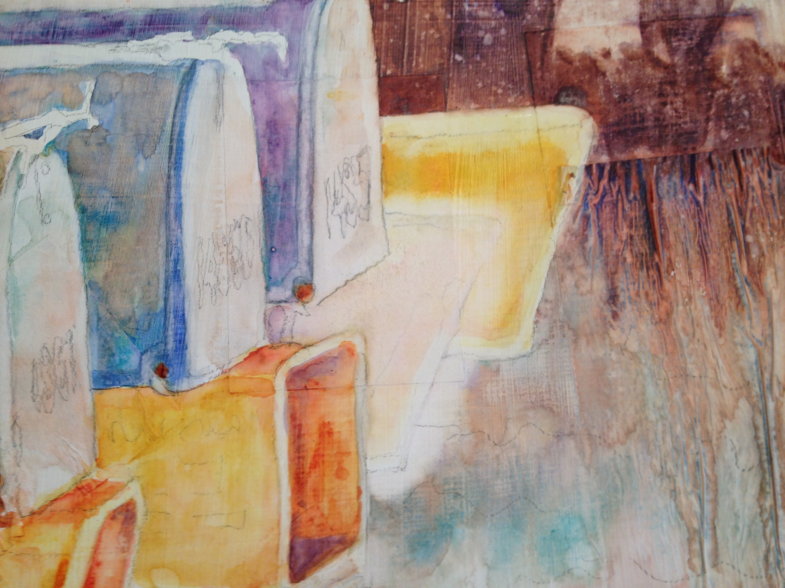
I went back into each area after first wash dried, adding darker values, details, and more intense color. Here is the painting at about 50% finished.

What I noticed about the painting (above) is that the newspaper slot (far back right, white), didn’t read clearly. It’s color was white in the photo, but I decided to go ahead and paint it yellow to echo the other boxes and make it less confusing. You can see that it’s yellow in the below photo. Also, another newspaper slot sat in between the last yellow and the white one. It didn’t need to be there. I got rid of it. Here’s how:

Because I’m working on gesso, Erasing a shape is easily accomplished. First, I used a stiff acrylic brush, loaded with water, to gently scrub away the shape of the box. I needed to soften all edges and remove color.

Afterwards, I used a blow dryer on the area and made sure it was completely dry before continuing.
Now, I could go in and re-create the edge of the yellow mailbox and extend the background beneath the box. Once I did that, I was unconvinced that the last (yellow) newspaper slot provided anything necessary to the painting. It didn’t. In fact, the area still remained a little confusing and I didn’t like the yellow shape protruding awkwardly towards the right of the painting. I ended up removing it and placing a farm fence behind.
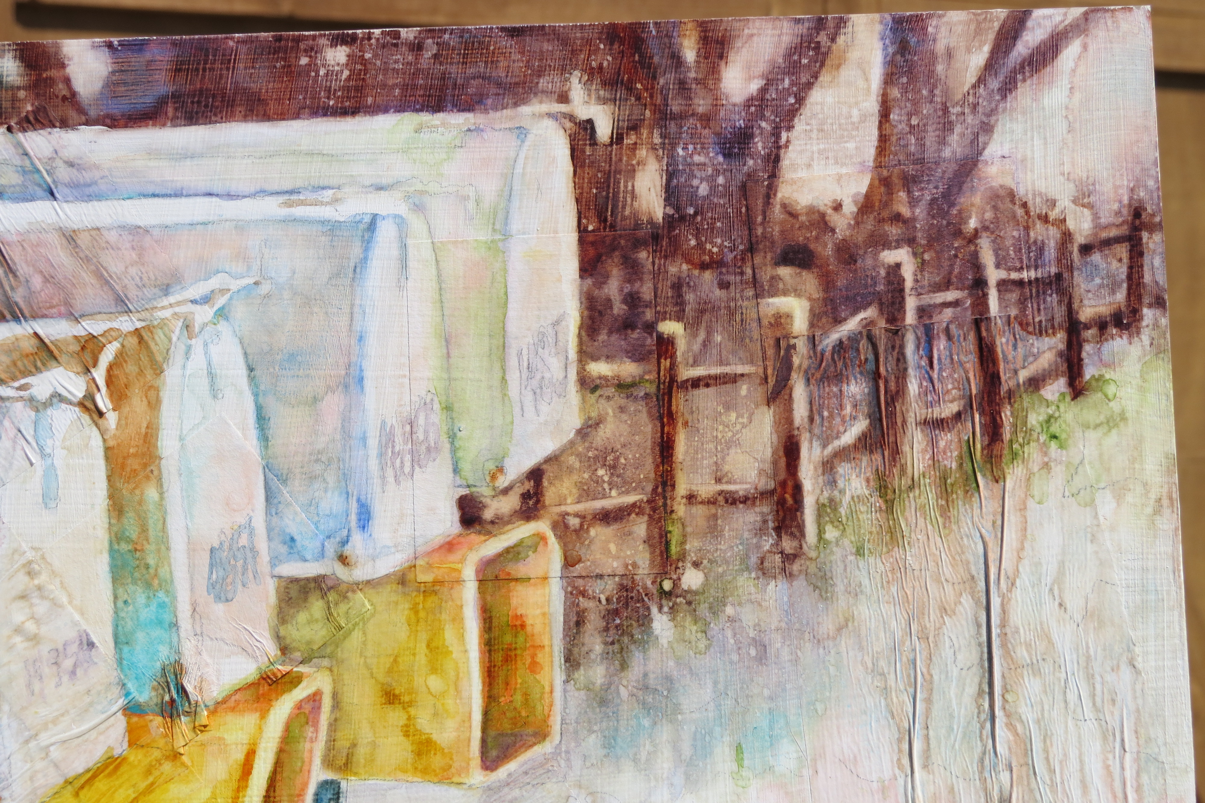
Next, at the focal point, I continued to work on detail, used my brightest teal with a complementary orange (rusty mailbox!), behind it to pop the color.
Final painting:
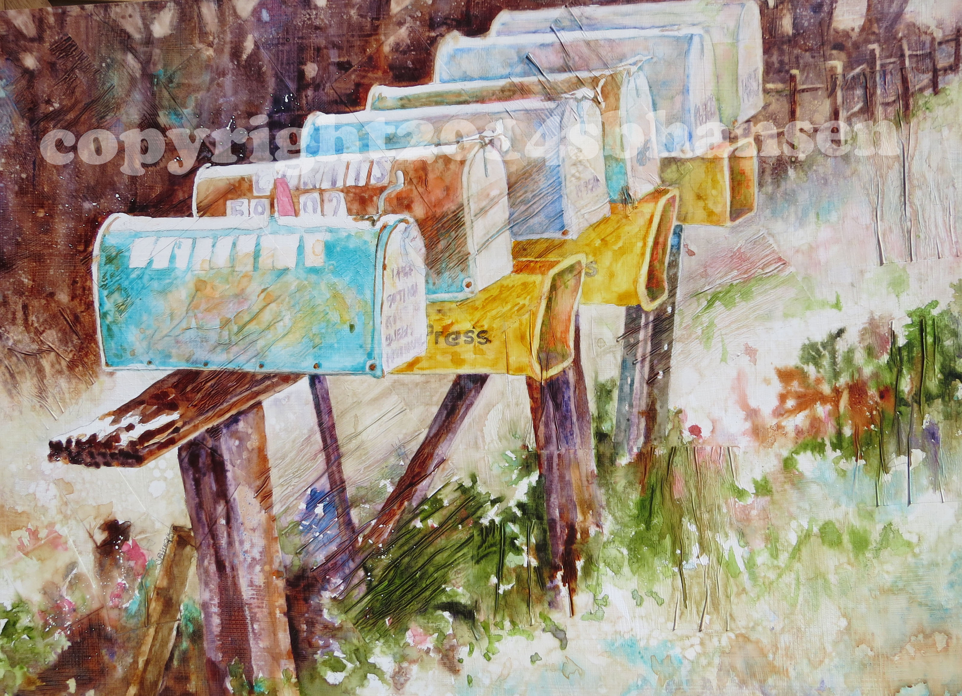
I still have to do a few minor adjustments, but overall, I’m very tickled with this, my first mailbox painting! I’m so excited to do more. What do you think? Do you like the fence changes? Does the painting intrigue you?
Let me know. And follow me, will ya? You must keep tabs on all the crazy painting going on around here. Now, I’m off to arrange a meeting with the president…

Profound thoughts? Not so profound? I’d love to hear it!