sbhansen ART Blog
About Sarah
Contact Sarah
Workshops
Paint Tuscany
Tag:
gessoed watercolor plexiglass painting
Painting Gallery
,
Step-by-Step
,
Travel
Petals…or Pedals?
Journey Back to Passion
,
Painting Gallery
,
Step-by-Step
This Fox ain’t no Crab Cake
Journey Back to Passion
,
Painting Gallery
,
Step-by-Step
Happy International Women’s Day!
Journey Back to Passion
,
Painting Gallery
,
Step-by-Step
,
Travel
Texture and Contrast in Portland
Journey Back to Passion
,
Painting Gallery
,
Small Watercolors
Hoppy Bunnytine’s Day!
Journey Back to Passion
,
Painting Gallery
,
Step-by-Step
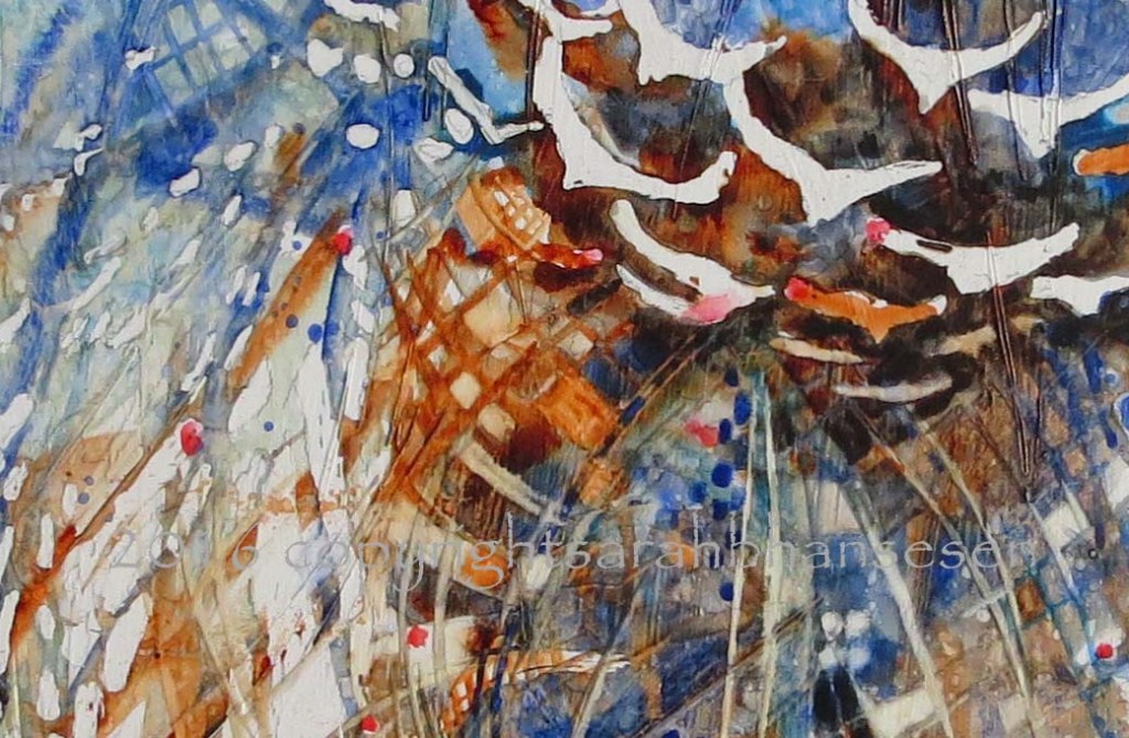
Rainbows in the Snow
Journey Back to Passion
,
Painting Gallery
,
Small Watercolors
,
Step-by-Step
Many Minis for Holiday Show
Painting Gallery
,
Small Watercolors
Small painting Thursday
Journey Back to Passion
,
Painting Gallery
,
Step-by-Step
Little Luna with Fuzzy Paws
Journey Back to Passion
,
Painting Gallery
,
Step-by-Step
,
Travel
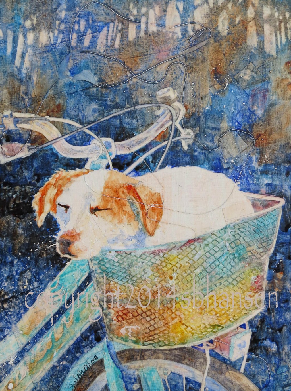
Happy Camper
Journey Back to Passion
,
Step-by-Step
Buddies
Journey Back to Passion
,
Step-by-Step
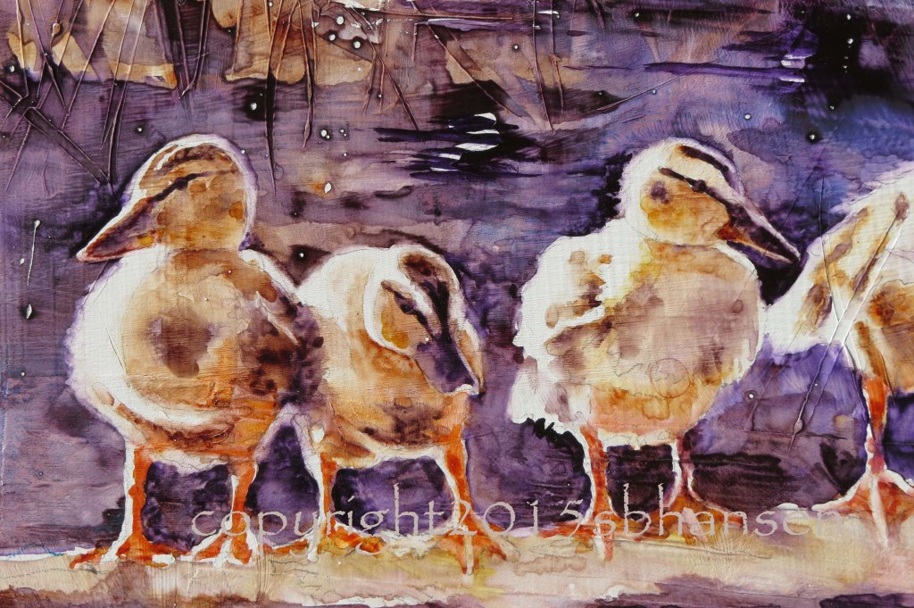
Ducks in a Row
Journey Back to Passion
,
Painting Gallery
,
Step-by-Step
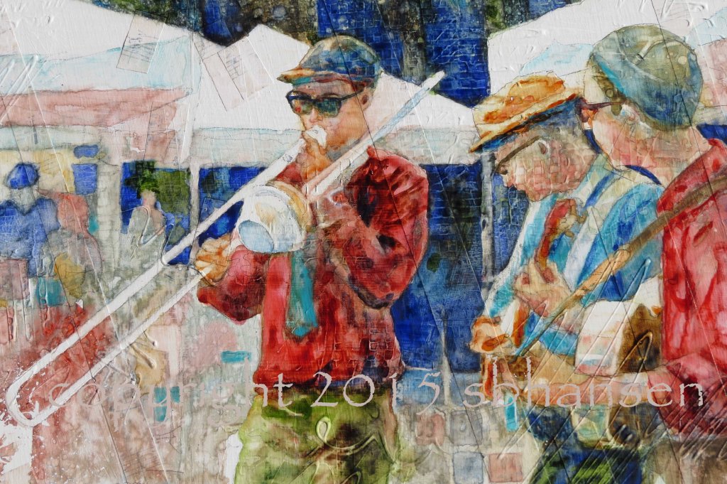
Musicians and Memories
Journey Back to Passion
,
Painting Gallery
,
Step-by-Step
Snoozin’
Journey Back to Passion
,
Painting Gallery
,
Step-by-Step
A Fit of Mailboxes
Privacy & Cookies: This site uses cookies. By continuing to use this website, you agree to their use.
To find out more, including how to control cookies, see here:
Cookie Policy
Subscribe
Subscribed
sbhansen ART Blog
Join 111 other subscribers
Sign me up
Already have a WordPress.com account?
Log in now.
sbhansen ART Blog
Subscribe
Subscribed
Sign up
Log in
Report this content
View site in Reader
Manage subscriptions
Collapse this bar