sbhansen ART Blog
About Sarah
Contact Sarah
Workshops
Paint Tuscany
Tag:
fruit
Journey Back to Passion
,
Painting Gallery
,
Thirty-Dollar Thursday
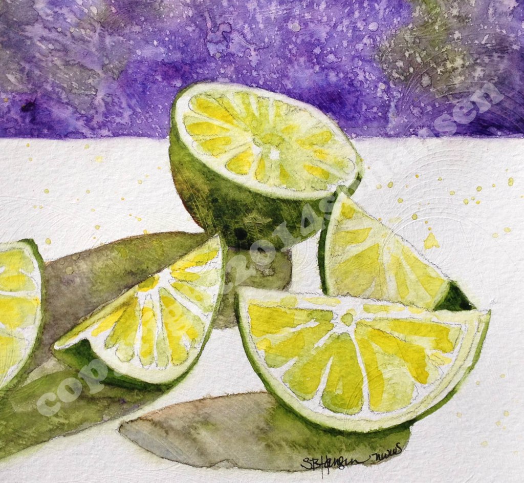
Thirty-Dollar Thursday Limes!
Journey Back to Passion
,
Painting Gallery
,
Step-by-Step
Squished Pears
Journey Back to Passion
,
Painting Gallery
,
Step-by-Step
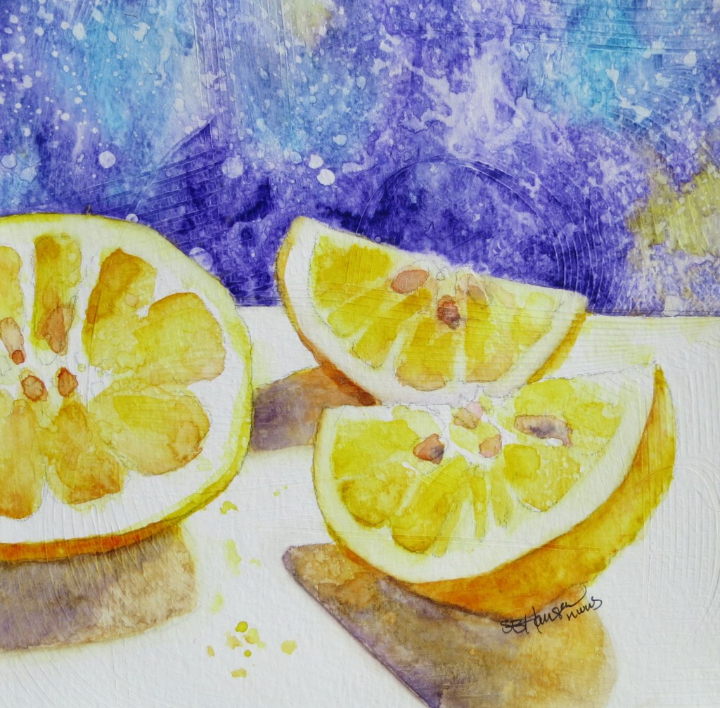
Thirty-Dollar Thursday Lemons!
Journey Back to Passion
,
Painting Gallery
,
Step-by-Step
Thirty-Dollar Thursday Strawberries!
Journey Back to Passion
,
Step-by-Step
Not so sure about this one…
Privacy & Cookies: This site uses cookies. By continuing to use this website, you agree to their use.
To find out more, including how to control cookies, see here:
Cookie Policy
Subscribe
Subscribed
sbhansen ART Blog
Join 111 other subscribers
Sign me up
Already have a WordPress.com account?
Log in now.
sbhansen ART Blog
Subscribe
Subscribed
Sign up
Log in
Report this content
View site in Reader
Manage subscriptions
Collapse this bar