Hoo-boy. This painting refused to cooperate. Fighting through a “boring” comment, wrestling with too-dull-red oranges, and a square composition, I forced my painting to sing. I think.
I’m still not sure if it turned out okay, if I have to be honest. It was a struggle from the get-go. Over the week, I read an article that refreshed my somewhat muddled brain about color theory. I LOVE color theory, but I had forgotten about some of the finer points, having not painted for three years. So I set about designing a painting based on the complementary theme of Blue Green vs. Red Orange, Orange, and Red. I also challenged myself to a square canvas. I had a berry photo that I thought would work well here, playing off the grids of the background and containers with the circular form of the fruit. Here’s the start:

You can see the grids of collaged paper in the background in my messy (but come on, it’s creative, so it’s messy) studio.
Next step, flinging paint:
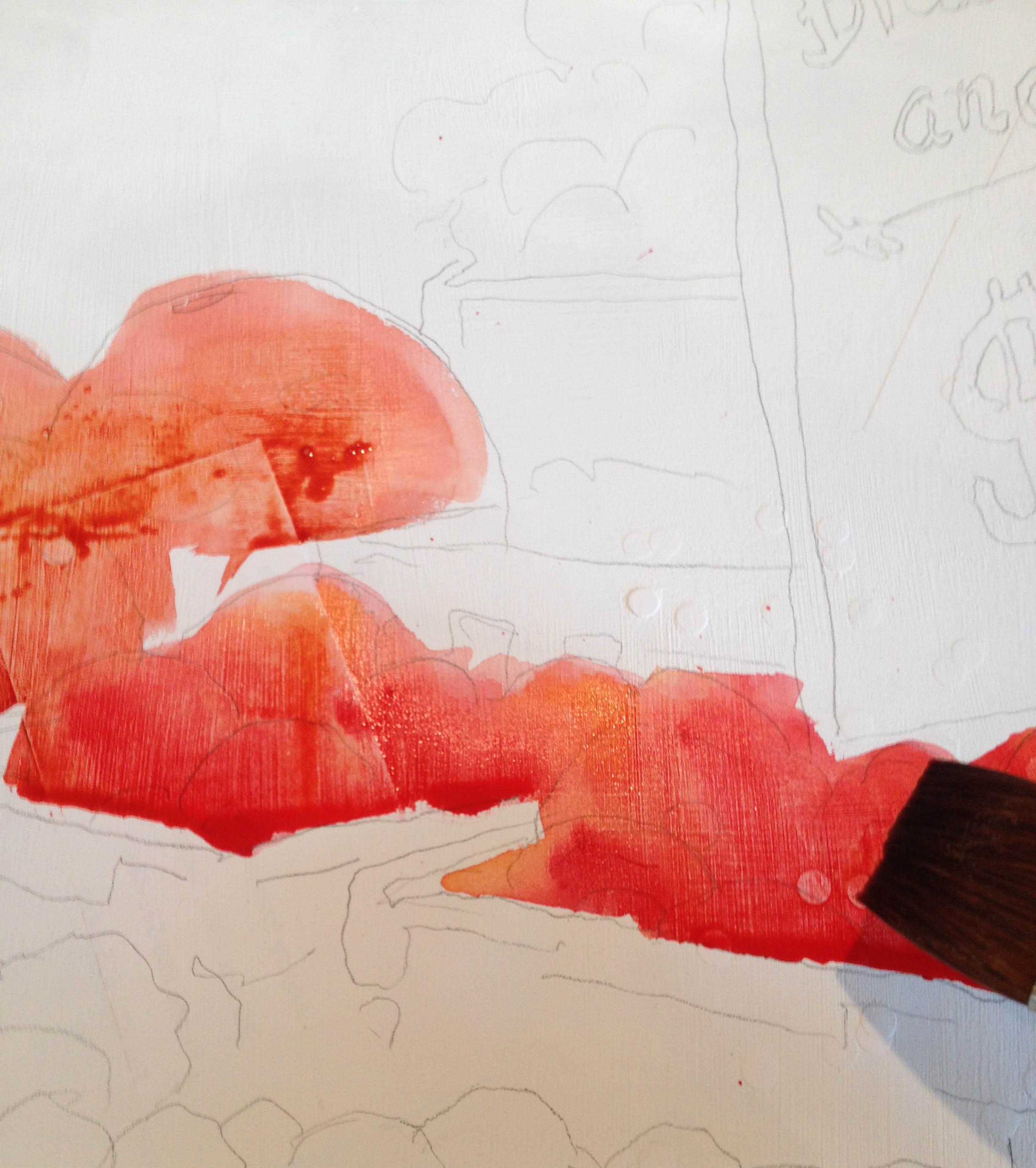
This is the fun part, laying in super-charged colors next to each other and letting them run. Looking back on this, though, I chose to paint with Daniel Smith’s Napthol Red, which, though it is a nice color when wet, becomes a little dead when dry and is very staining. I wish I had gone with my usual, the friendly, the colorful, the happy Quinacridone Red from Daniel Smith.
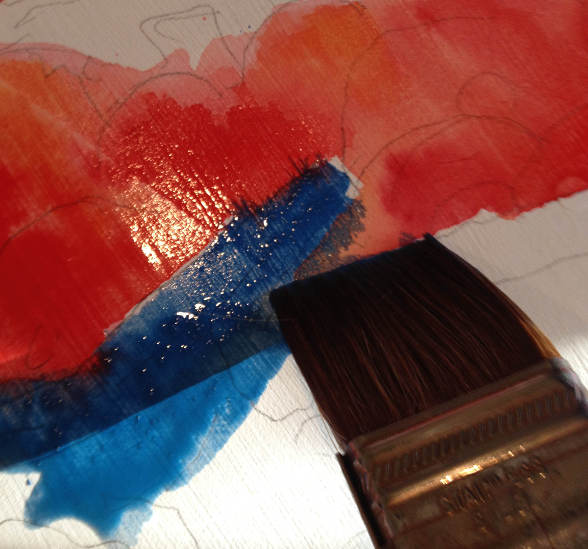
I love mixing the super-charged colors next to each other and watching the action.
The first wash:

Okay, okay, this is a horrible photo, but you get the idea. You can see where I’ve blocked in the colors and let them bleed together. I began to get a feel for the composition here, though I wish I had done my usual thumbnail sketch with this piece to get a better idea with value placement and composition. Hmmm…it’s not singing and I’m not so sure about it, but I’m trudging on. Like I always say, every painting has it’s teenage phase. Sorry kids…
This painting still didn’t sing. I wasn’t if it was the colors or the layout or what. So I did the smart thing (?), I presented it to my teenage son.
“Well, Mom. You know?” (tap, tap, tap on the ITouch). “What? What do I know?” “You know…(long pause)” No, I really didn’t know. That’s why I was asking him. A bit difficult when his eyes were so trained on his little screen thing. “Earth to son…what do you think of the painting?” “Yeeeaahhhh…it’s a little boring, Mom”. Sheesh. Like pulling teeth. But it gave me an idea. Which was the whole point. Remove the oranges.

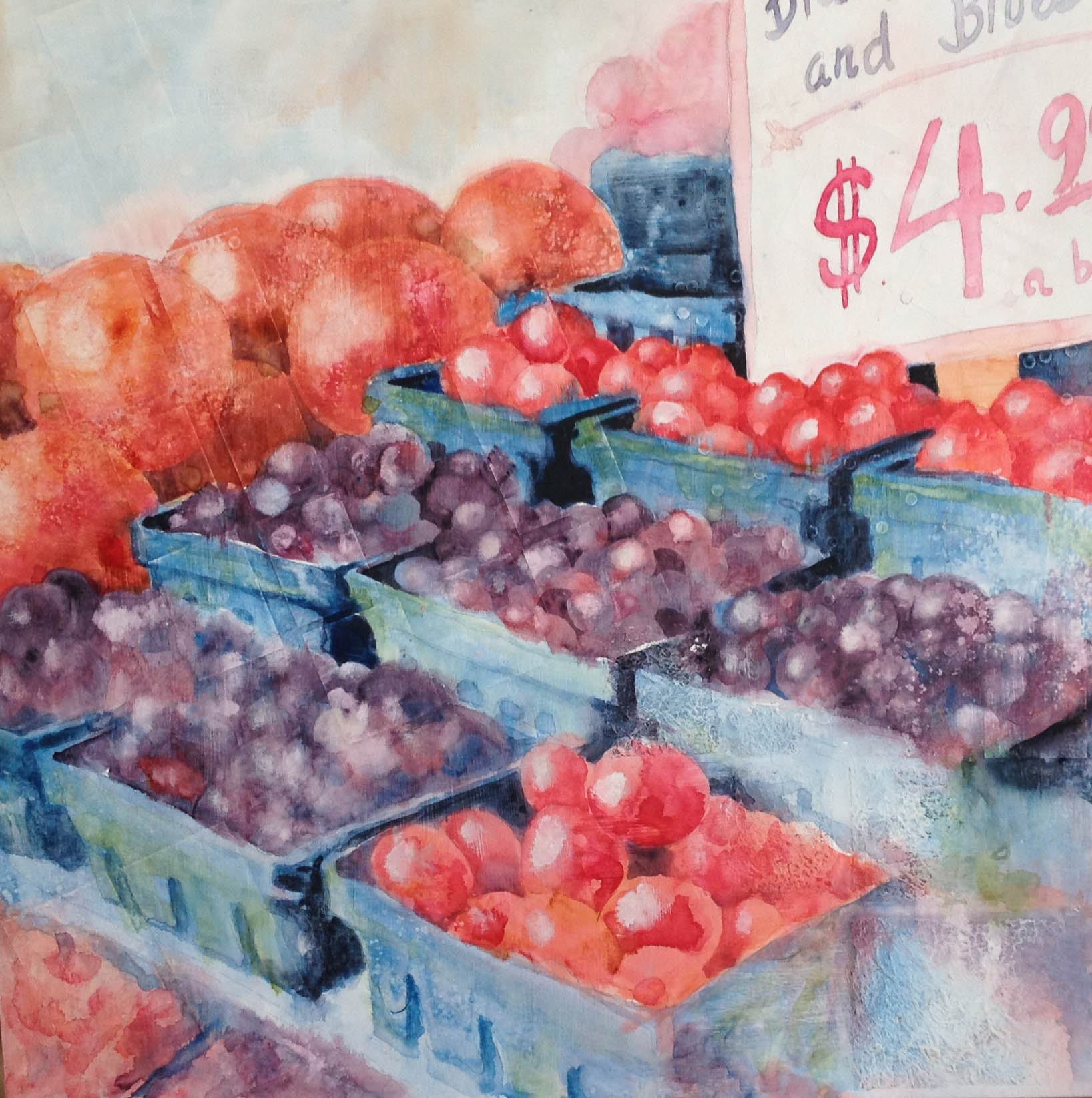
Go away, oranges! You are too boring and add nothing to the painting. Too much orange and blue fought one another. When using complementary color schemes, one color needs to dominate. The oranges and blues were too equal in amount and intensity. Also, the orange line on the horizon was too straight.

What do you think? I looked at this for a day. Took it back to the son, who was involved in an ITouch game with his brother. Both were engrossed in the game, both were semi-involved with the conversation, both thought the painting was still boring. What is it with this boring thing? I’ll tell ya what’s boring. How about playing on the ITouch for hours? How about that being boring? Huh? Huh? Deaf ears. Anyway, my solution:

When I’m in Pike’s Place Market, there are many windows, signs and square containers. I always like the window/rectangle grid in my work, and added them there, reminding me of the windows and adding a counter to the round fruit. The grids, hopefully, also removed the “boring” word from the painting’s now-established identification.
Alas, I had to noodle some more:
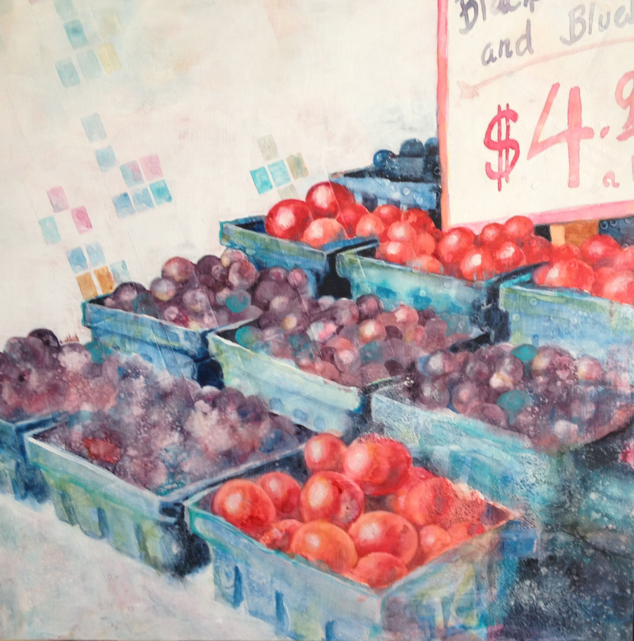
I removed the rectangles from the foreground, so I had a sense that the containers were on a surface. I also darkened the area in the lower LH corner. I haven’t come up with a name for the painting yet, but darned if I WON’T call it “Boring”. What do you all think? Was this painting a success? Have any ideas for a name?

Profound thoughts? Not so profound? I’d love to hear it!