Light has different texture depending on your location. When I lived in Portland, Oregon, light had a diffused, soft green cast. All the humidity in the air? Or was it all the GREEN everywhere you looked? Colorado light, on the other hand, had an intensity to it. Very bright and hot in the summer, crystal clear, blinding. I think it may have to do with the dry air and the altitude. On the Oregon Coast? Hazy grey and soft. Look around you as you travel from place to place. You will begin to notice and see what I mean.
Light compelled me to paint a friend’s photo this week. She had taken a holiday in Italy this past year. After she returned, we sat, with beer in hand (I’ll convert you yet, Shirley!) outside on a sunny day at Anthony’s Restaurant in Bend, to look at her (million) photos. Okay, she went crazy. But no problem here! Italy looks to be fabulous and her photos were astounding! I can only imagine the sheer number of photos I will take next year (Join us!).
The quality of light in her photos struck me time and again. Italian light is different than ours. One photo in particular kept popping up in my head. I printed it out and studied it periodically. How could I convey the light?
So excited to say I worked on it and finished the painting!
The Painting
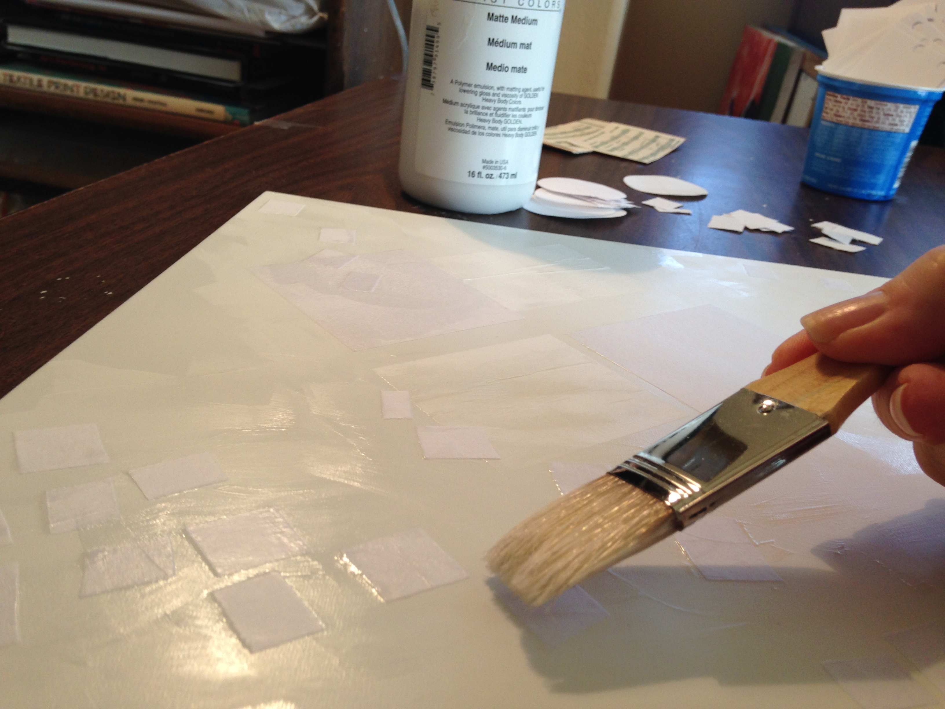
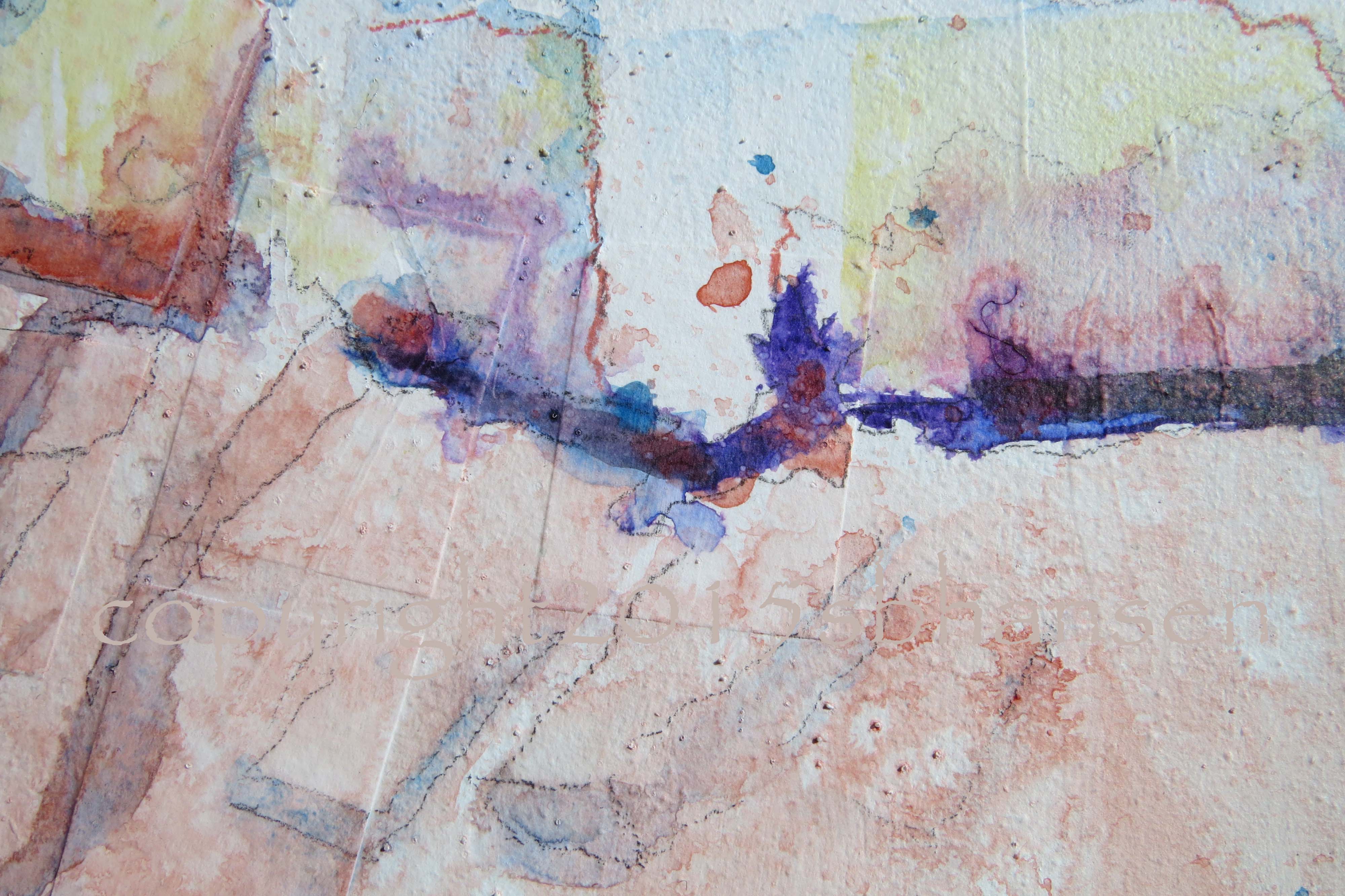
I prepped my canvas (Clayboard) by scattering random rectangular shapes of paper in the upper brick areas of the walls, scribbling into wet gesso and salting (yep, table salt) in the lower area to hint at textural limestone and bricks, heat and dust.
The composition layout divides the upper third with a dark doorway, while red flowers in the planter located in the cross hairs of the upper RH third of the canvas stand as the focal point. Most of the middle third is flooded white with sunlight and untouched by paint.
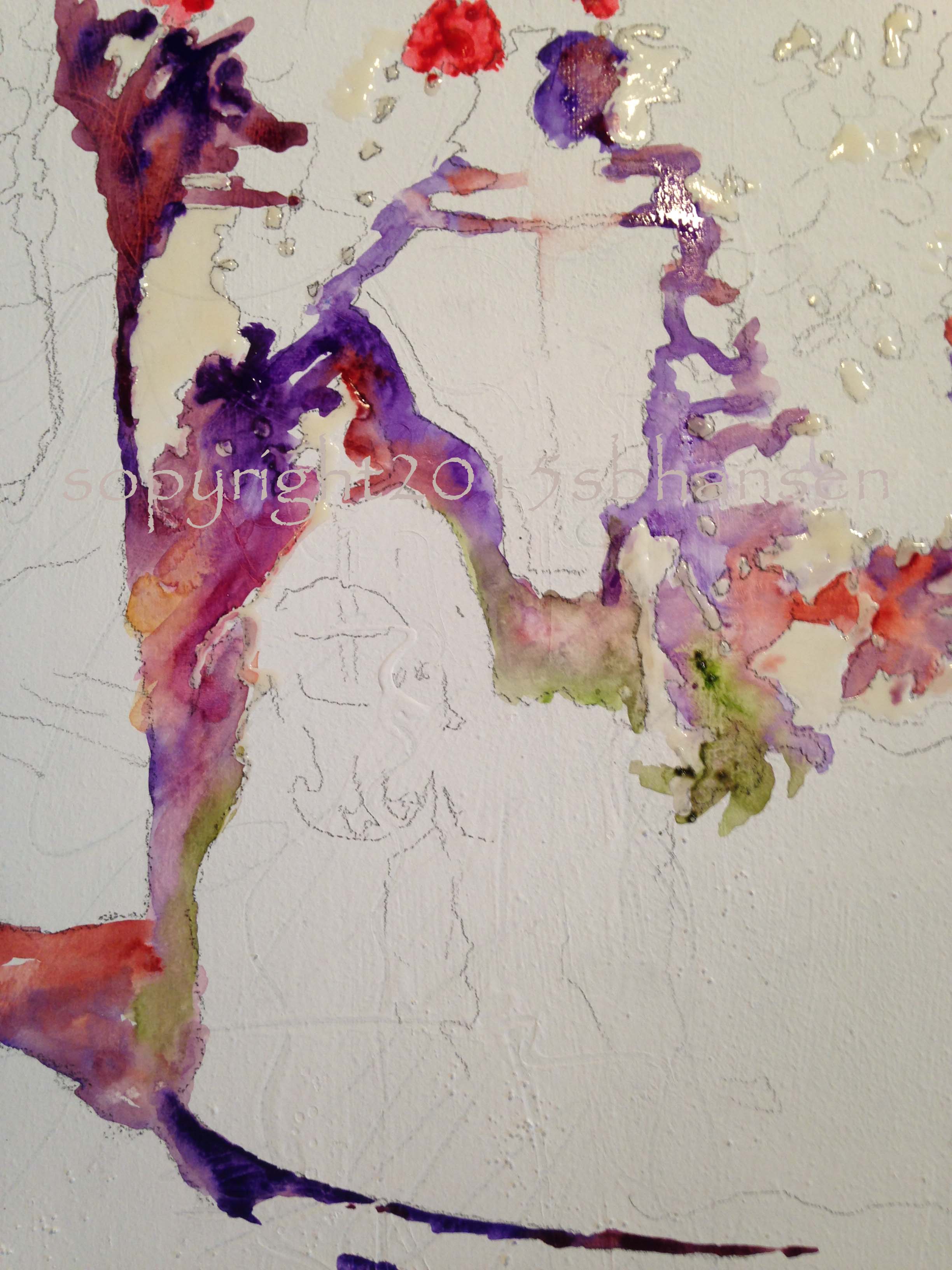
Beginning with the foliage shadows, I mixed in purple, sap green, and quinocridone burnt scarlet, letting them mingle next to each other on the canvas. Once the shadows set the tone, I moved on to the first wash.
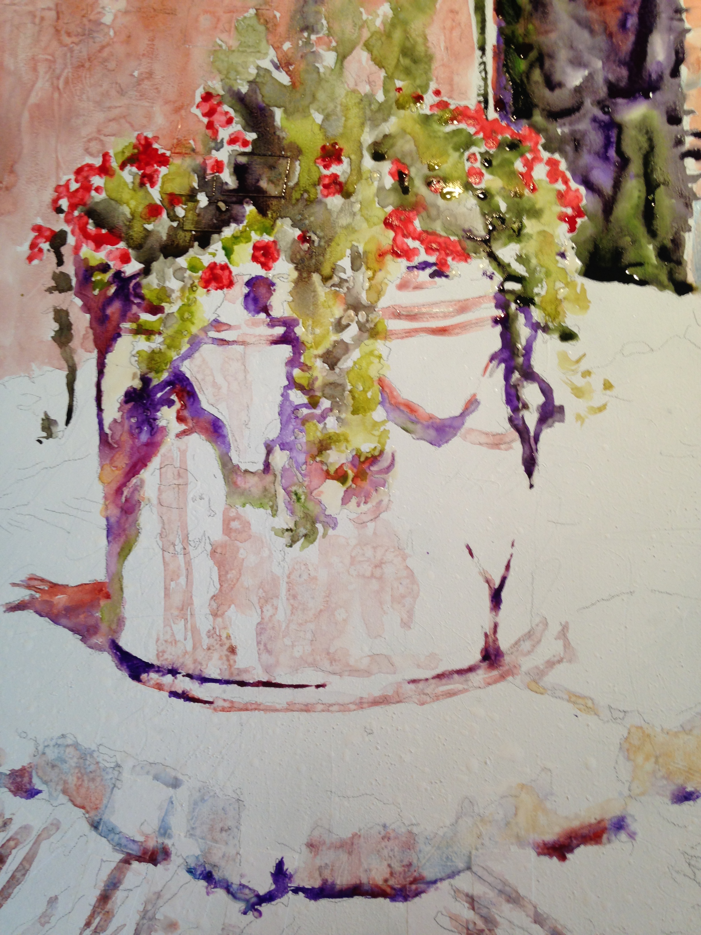
Quinocridone burnt scarlet proved to be a perfect choice for the background wall bricks. I later used cerulean blue to “find” grout lines between some of the bricks. The rectangular squares I had cut up and collaged into the surface provided random brick structure.
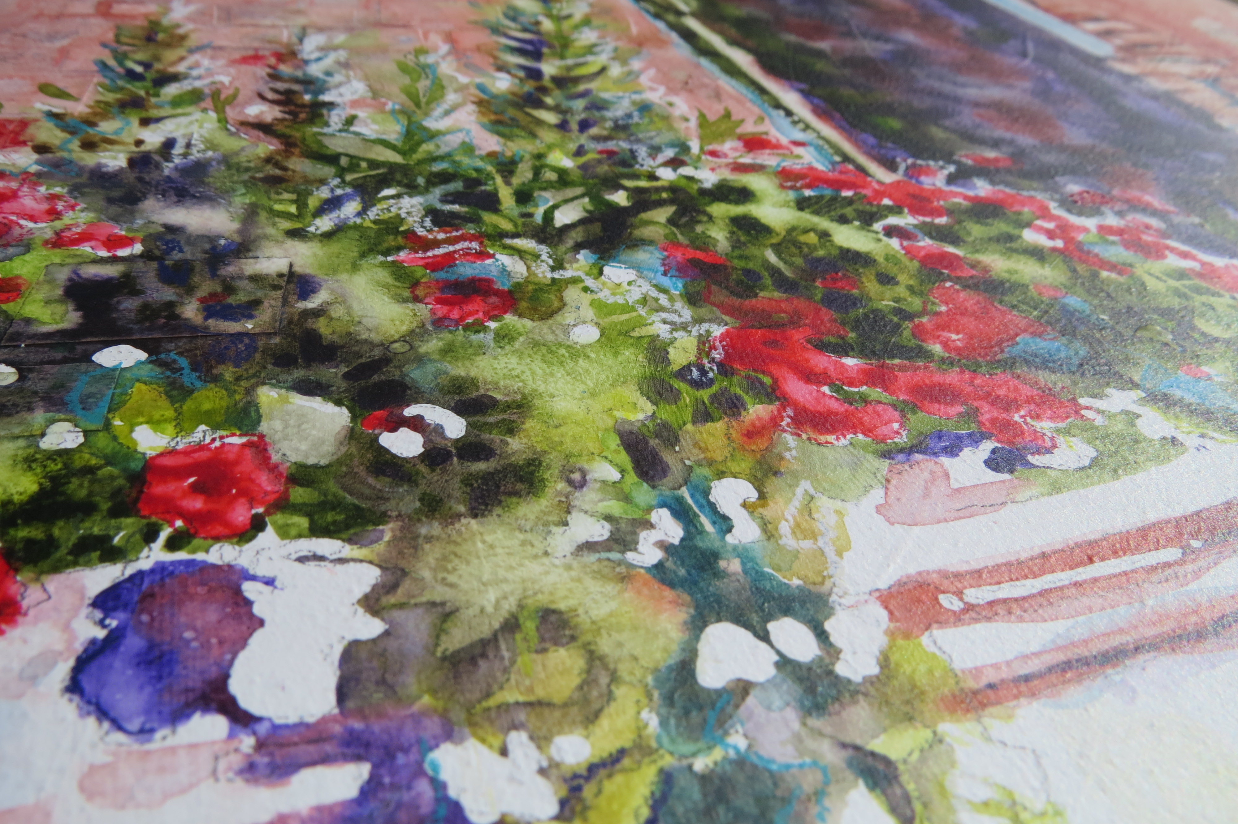
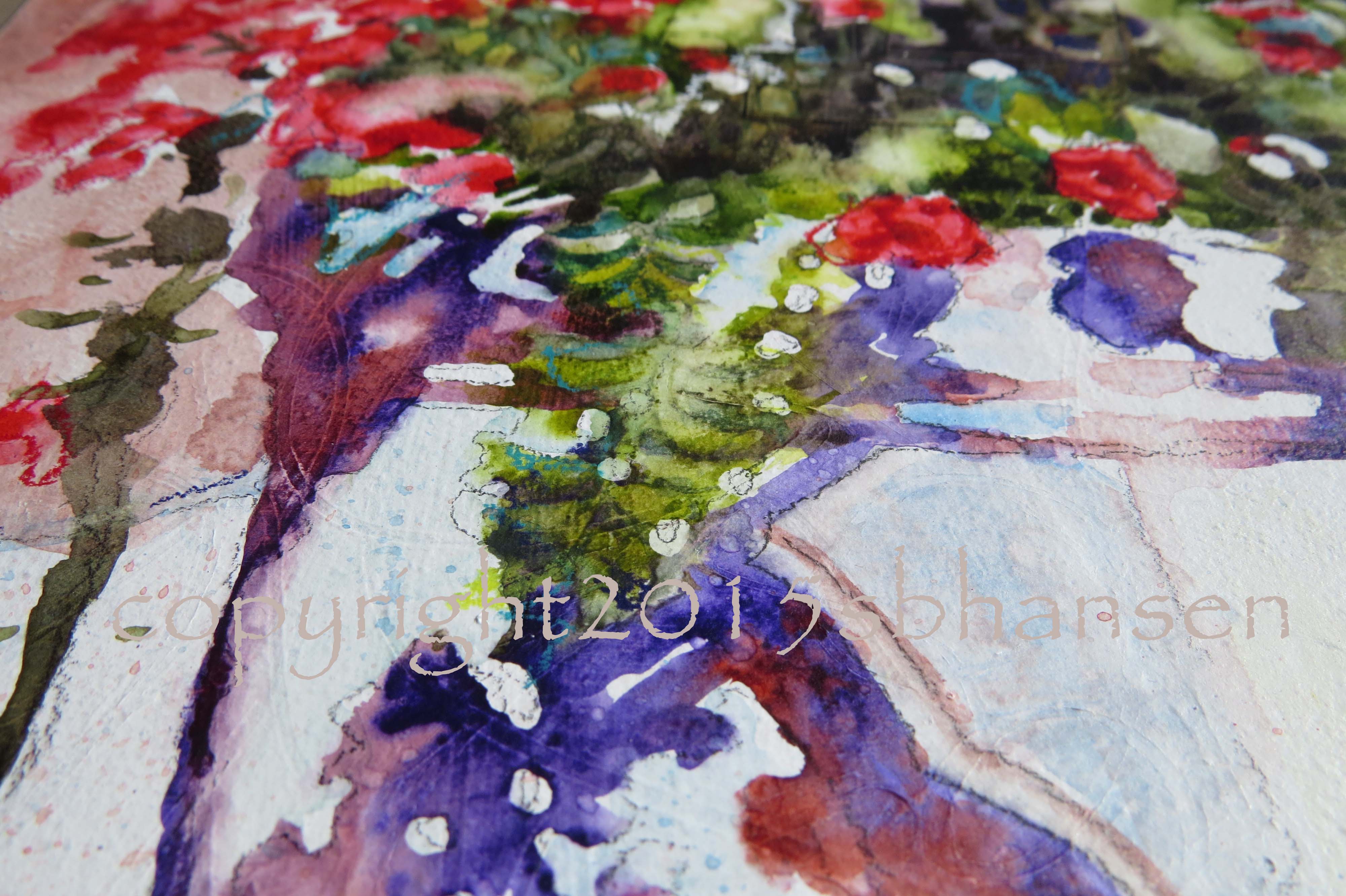
I found the foliage to be the most difficult, but after taking time to allow the first coat to dry, I meticulously painted negative forms between the leaves and flowers, grouping dark and mid values together into interesting shapes. Afterward, I softened, and removed large areas of light and detail, to give the area sun-soaked, softer leaves.
I had fun with the limestone. If you look closely, you can see salt in the texture.
Here is another close-up of the planter with the flowers, showing shadows next to the leaves.
After I finished painting, I went over areas with watercolor pencils and crayons, adding calligraphic scribbles and line work for exciting movement.
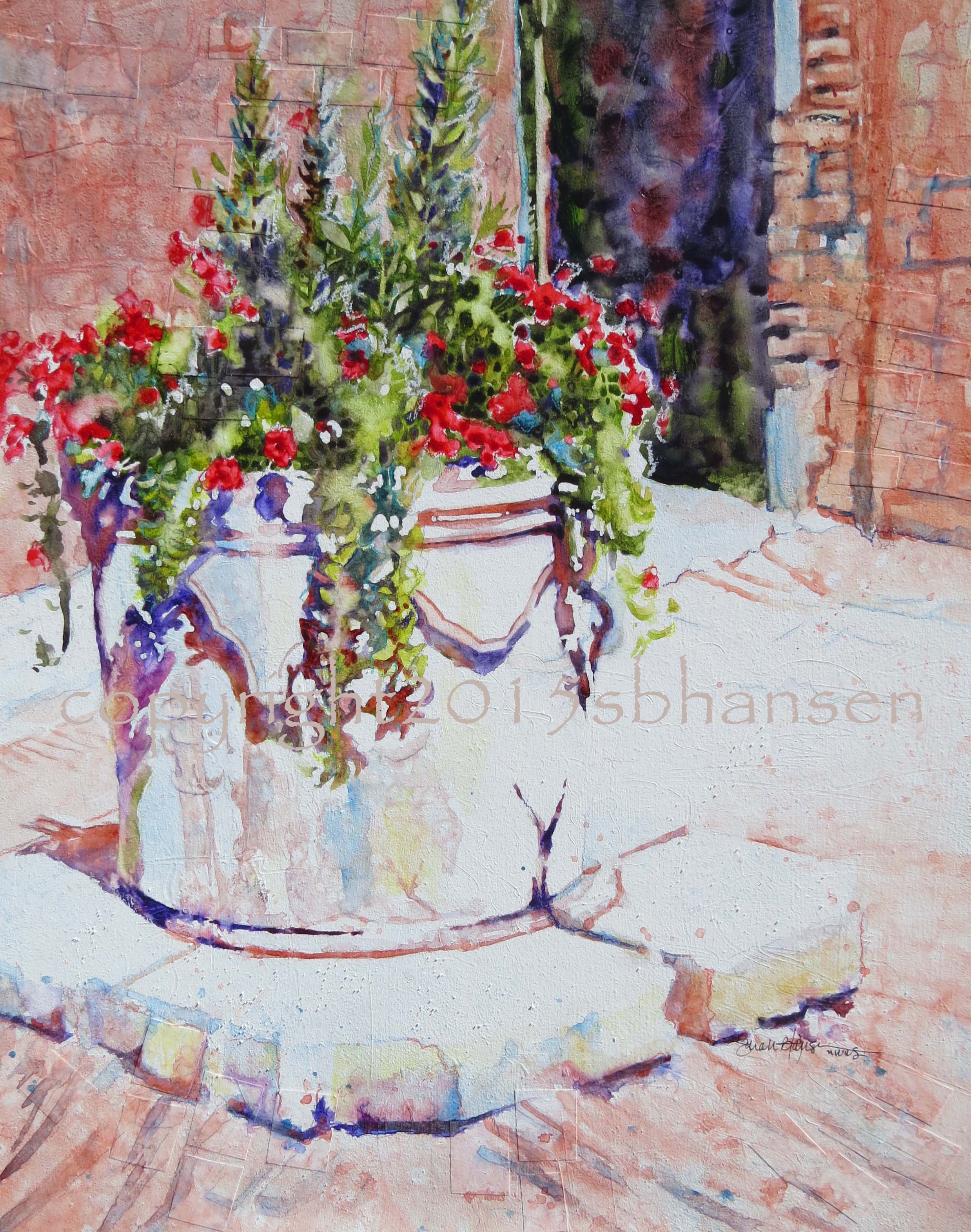
What I love most about this piece is the sun-soaked, white light. Up close and in person, it really has a beautifully Mediterranean feel to it. The texture reminds me of sand and cobblestones. Transport me now! And, Whoop, Whoop! I did it! I painted Italian light!! Such a fun painting, a different subject for me than normal. What do you think? Did I capture Venice Light?
To purchase, send me an comment. I accept PayPal and will email a PayPal invoice. Shipping extra. Prints available. Please check back often, I’m working on an Etsy site for prints and should have it up soon.
Follow me on Facebook and Twitter and follow this blog to be informed of amazing new paintings and deals!
Keep creating to Feed the Beast! Support each other, people!:)
All images and paintings on this site copyrighted by Sarah B Hansen.

Profound thoughts? Not so profound? I’d love to hear it!