Is there anything better than popcorn, I ask you? Salty, buttery, crunchy? There is no better snack, I say! But let me tell you…difficult to paint. Very difficult to paint.
I began with a composition layout and value study to determine the best impact of this snacky-snack painting. I took the photo outside in my yard with the afternoon sun highlighting the kernels from behind. My son kept stealing from it, so I had to work fast before it all disappeared.
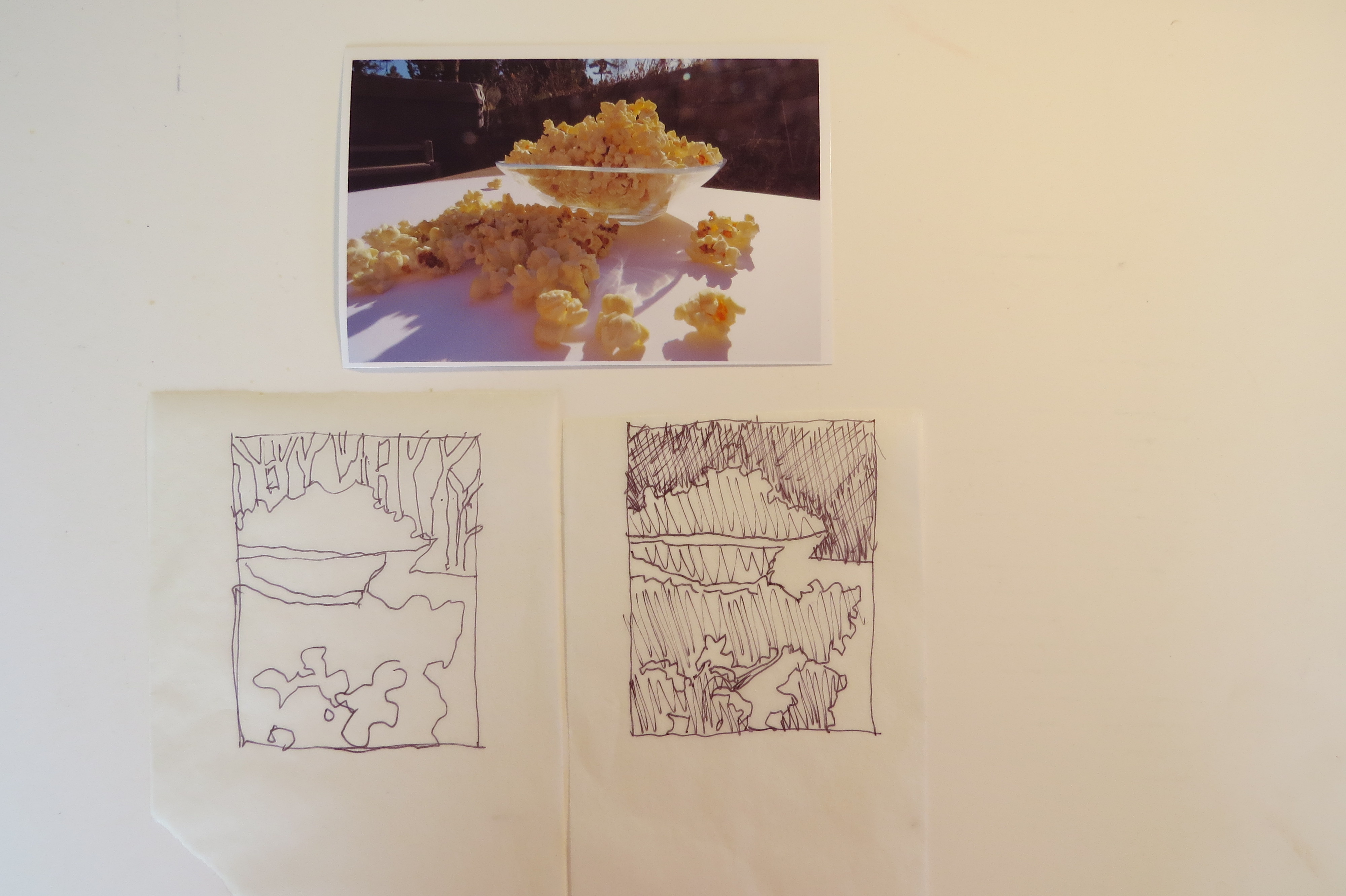
Procrastinating the actual popcorn-painting, I began with its shadows.
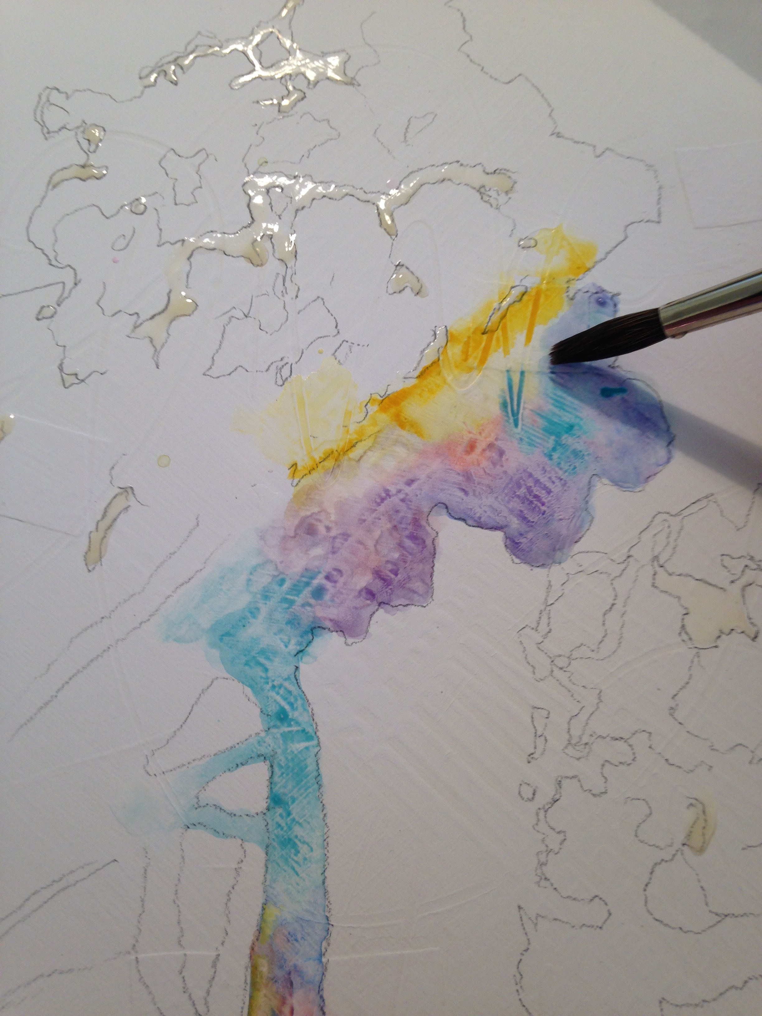
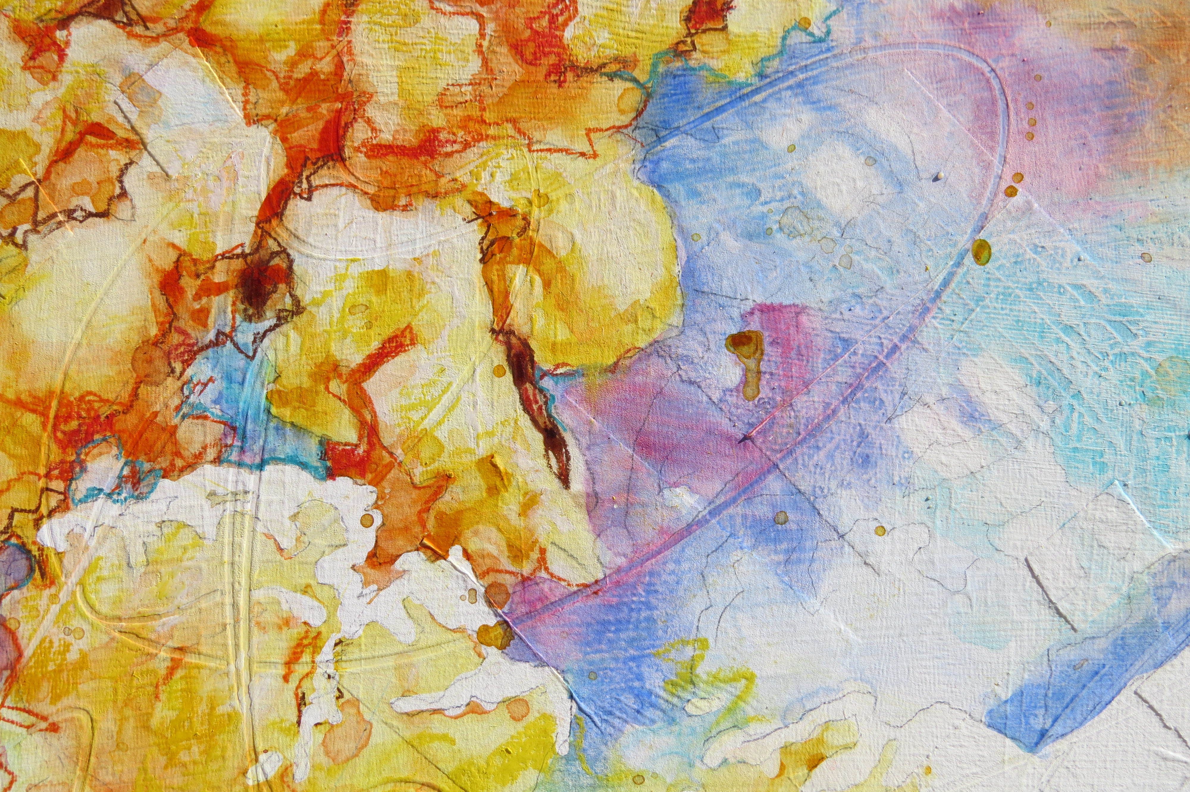
An initial wash of cobalt teal, gamboge yellow, cobalt blue and quinocridone red, placed side-by-side on the textured canvas created the colorful shadows. I loaded the brush with each color and let them mingle.
Still working on the shadows and still putting off the actual painting of the popcorn, I worked further on the details and hoped for inspiration on how to convincingly, yet loosely, paint popcorn. Getting a little courage, I dropped a dark orange mixture onto the popcorn shapes to indicate kernels. Good for you, Sarah! Way to go! Showing real promise here! I stopped to “evaluate” at this point. Got some tea, made a snack, put laundry into the washer, swept the floor. Thought about starting a different painting.
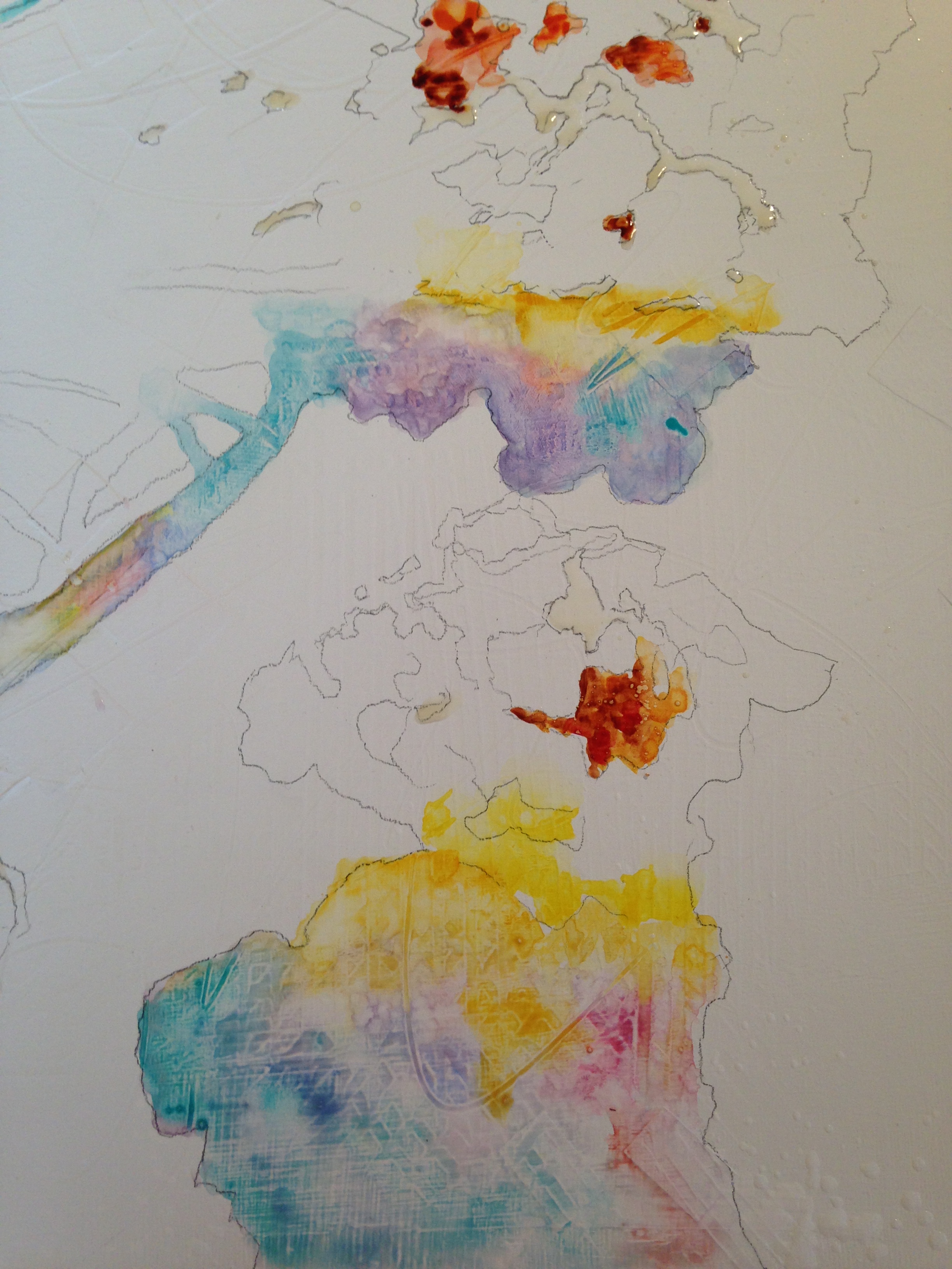
But enough of that cowardly stuff! Time to go for it! I returned to the studio and finished the shadows of the glass bowl. Avoiding the popcorn.
Shadows close to the bowl and the popcorn had a warm glow. Calligraphic marks I had created in the wet gesso before I began painting can be seen in the bowl shadow. Clearly, though, the shadows were finished. I MUST go forth and conquer. I had to paint popcorn. After all, it was the subject of the whole painting!
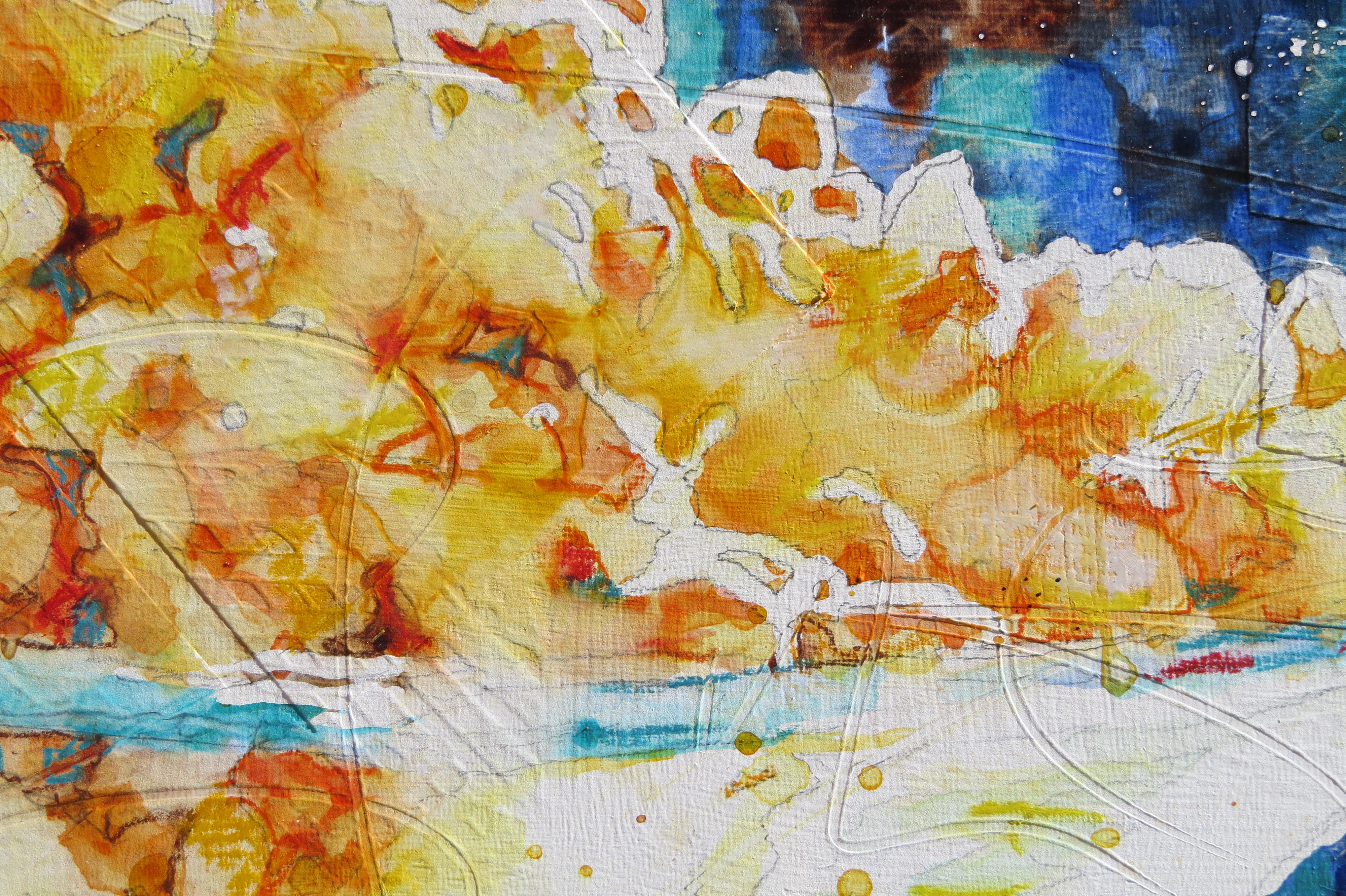
Courage in hand, brush loaded with paint, I dabbled in the puffy shapes. I connected mid-tone values, the high values, the dark values, grouping them into irregular shapes. VERY difficult to do. Here is a detail shot of the popcorn next to the shadows. You can see the calligraphic marks I had made into the base, creating movement and energy, as well as some of the popcorn shapes.
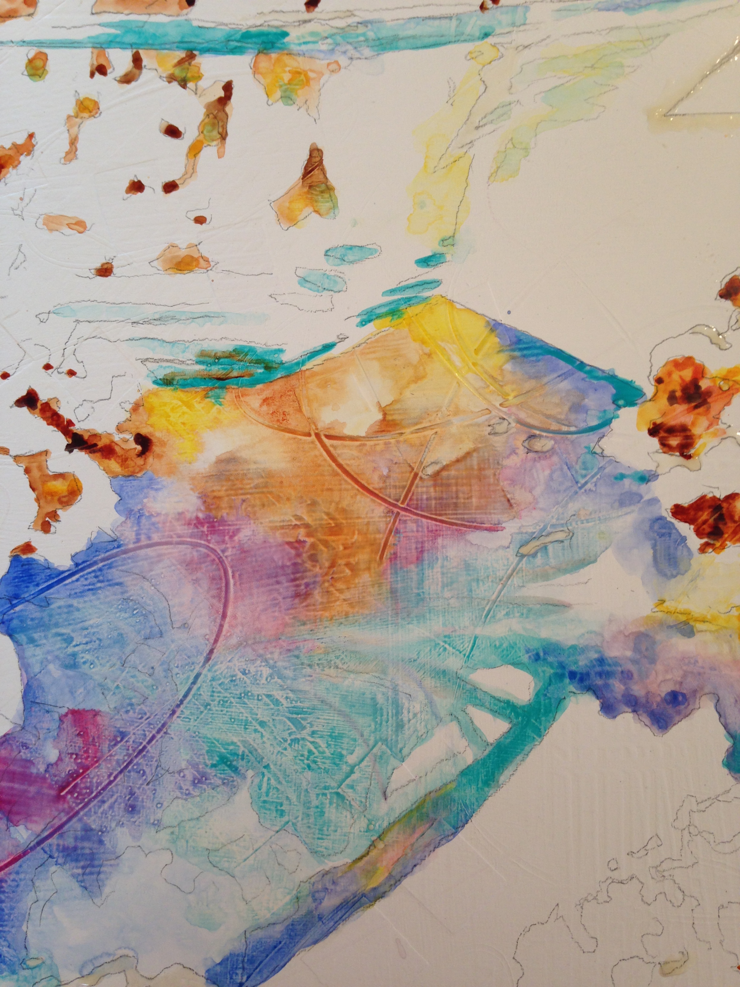
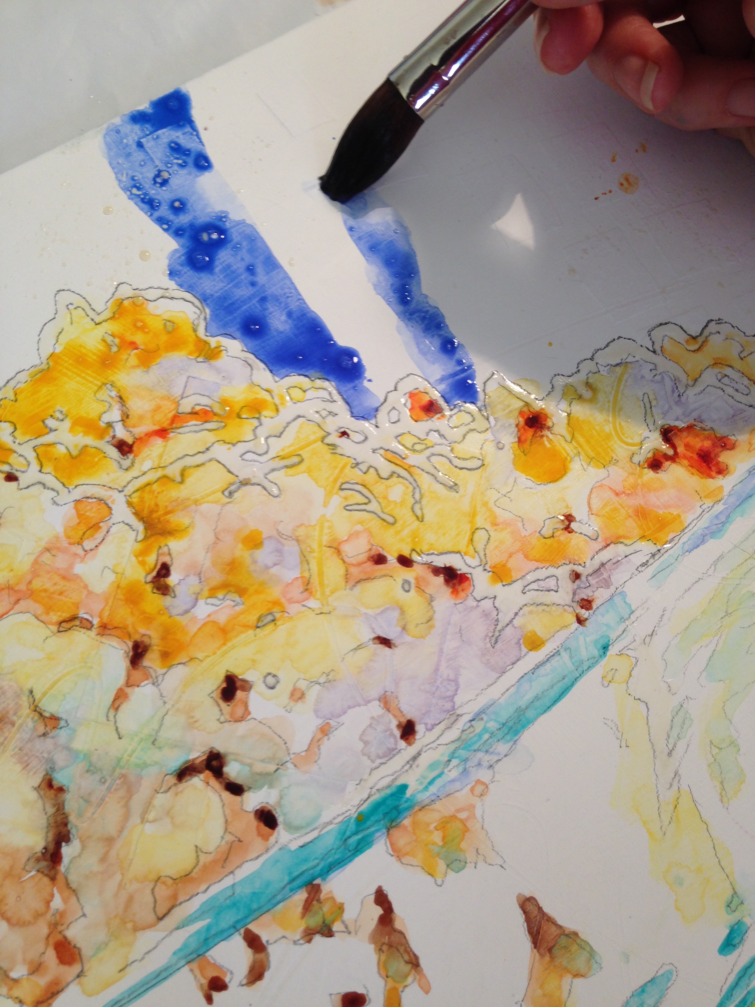
After working diligently on the matter at hand, I proudly stepped back to observe the beautiful, desirable popcorn in the bowl. BUT! The popcorn in the shadow area of the bowl looked moldy after I used cool colors for their shadows! What!? MOLDY! Ugh! Unappetizing and gross. So much for courage! So much for creativity. I made a mess. Purple/blue popcorn did not equal buttery yummy-ness. I now knew what DIDN’T work! I wiped it off and changed tactics. Time for some warm shadows. Orange, brown, and red.
Above, you can see where I used rich butter yellow and orange in the shadows, with just a hint of cerulean blue in small doses. Okay. I can live with that. As long as it doesn’t look like a bowl of beans.
The background was next, an easy counterpoint to the corn. Deep Ultramarine Blue in the background set off the yellows and oranges of the popcorn, providing a dark, cool contrast to the subject. Vertical lines add structure and seem like reflections in windows.
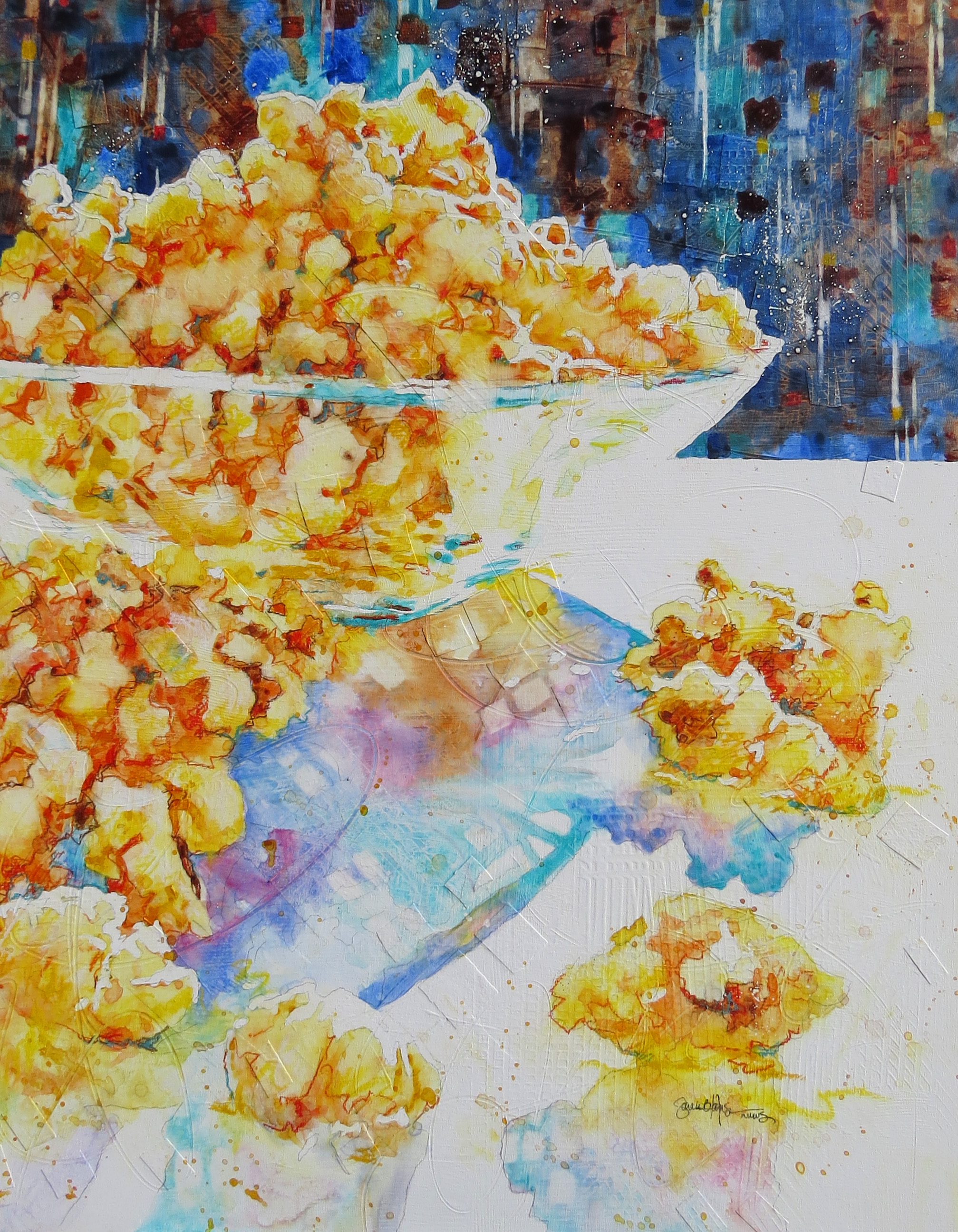
I splattered paint and salt around the white of the paper to add to the excitement of Popcorn Blast. I wish you could see it in person. It is very textural and fun. But again, it is VERY difficult to paint popcorn. If any artists reading this have painted popcorn, I’d love to hear about it. Success or failure? What do you think?
To purchase, send me an comment. I accept PayPal and will email a PayPal invoice. Shipping extra. Prints available.
Follow me on Facebook and Twitter and follow this blog to be informed of amazing new paintings and deals!
Keep creating to Feed the Beast! Support each other, people!:)
All images and paintings on this site copyrighted by Sarah B Hansen.

Profound thoughts? Not so profound? I’d love to hear it!